
CATALOG REDESIGN
Lead Designer
January - March 2018 (3 months)
Objective: To create a more intentional experience for the Catalog page that addresses customer needs and can reduce bounce rate.
BACKGROUND
The company was in a state of “Code Orange” - in short, it meant that we were hitting significantly below the numbers were hoping to it for the past few quarters. One of the key areas the company was hoping to address was the catalog page. Beyond the catalog’s visually inconsistent and prehistoric look, the catalog had one of the lowest hit rates and highest bounce rates.
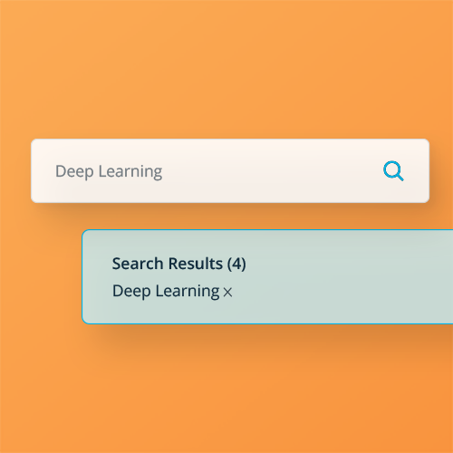
The catalog page operated with a semi-functional search bar. Heat-maps indicated a lack of interaction with the page which pointed to users being generally lost on the page and thus leave the page or site altogether.
USER RESEARCH
Working with the Product Manager and our User Researcher, we conducted two rounds of qualitative and quantitative research to understand where are users are coming from and what needs the catalog should address at that stage of their journeys.

Previous Catalog Design (edited for dramatization)
DISCOVERY

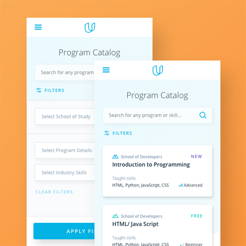
It was crucial to understand where visitors were in their journeys to becoming Udacity students. In context to the rest of the pages we can direct our users to, the catalog page needed to be specific to those that were fairly confident in Udacity’s product offerings and were searching for specific programs that would meet their needs. Tools needed to be built out to help our power user navigate to the program of their choice intuitively.
Unmet Needs
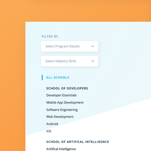
We discovered that majority of people were searching based on subject matter but mainly for skills they wanted to “level-up” with in the industry. This pushed for a large reconstruction of how we categorized and tagged our Degrees according to skills that the industry was demanding for.
KEY FEATURES
Users do typically purchase on their first visit. It is a high price-point that we are offering our education at and so it’s expected that our users will normally take 24-48 hours to make that purchase decision.
Catalog needs to be a page that will accommodate both experiences: The first-time users who are searching for the right program to apply to their work as well as the returning users who are ready to purchase and want to get to their desired programs as quickly as possible.


Results
The redesign launch and implementation went incredibly well - incoming traffic to catalog (on average) went up by 200% over the course of a year. It continues to be the highest clicked-on page of the marketing page. Though the work on this is far from done.
A key next step that the team is strongly pushing for is to surface the Catalog Search component on the homepage in order to get users quicker to where they want to.
Project Responsibilities: User Interviews & Research; User flows; Wireframes & High Fidelity Mockups